Supply and Demand for TradeStation®
Supply and demand zones can often indicate institutional buying and selling. Institutions cannot just enter one large trade at once. Instead, they need to slowly build their position over time. And often their positions are so large that they will absorb all interest which then leads to big and explosive moves on the charts.
The highest probability price levels are the ones with the greatest imbalance between buyers and sellers. This indicator performs statistical analysis of price and volume to highlight potential areas of support and demand.
The package contains one paintbar indicator:
The highest probability price levels are the ones with the greatest imbalance between buyers and sellers. This indicator performs statistical analysis of price and volume to highlight potential areas of support and demand.
The package contains one paintbar indicator:
- IBH SD - Paints bars on a chart analysis window or displays results in a RadarScreen
Getting Started
Click here to download the FREE IBH SD.ELD file that contains the product.
Please realize that this is not your typical supply and demand indicator that asserts to "know" where turning points exist. This indicator does not:
Please realize that this is not your typical supply and demand indicator that asserts to "know" where turning points exist. This indicator does not:
- Highlight only extreme tails
- Select the bars based on the "look and feel" of the preceding bars
- Look across multiple time-frames
Documentation
Sample Workspace
Click here to download the IBH SD SAMPLE WORKSPACE.TSW file for TradeStation 10.0 Update 64 and higher (newer). If your platform is older than Update 64 then you will not be able to load the workspace, but you will be able to create new charts with the indicators provided in your subscription.
The workspace contains several charts/RadarScreens with one or more of the Supply Demand paintbar inserted into them. Start with this workspace to gain expertise in building charts to support your trading. Then you open the sample workspace you will see the following 4 windows:
The workspace contains several charts/RadarScreens with one or more of the Supply Demand paintbar inserted into them. Start with this workspace to gain expertise in building charts to support your trading. Then you open the sample workspace you will see the following 4 windows:
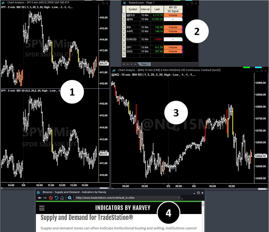
Chart 1 - Intended to show the difference between a Time-based and Moving sample-based Mode
SPY 5 minute chart interval in the top and bottom.
The top portion of the chart is set for moving period-based analysis, 3 standard deviations, sample size of 20. This configures the indicator to look at the last 20 bars and compare the range and volume of the current bar to those bars.
RadarScreen 2 - An example usage.
The radarscreen and chart 3 are symbol and interval linked to Chart 3. Additional bars to load has been modified. The inputs are set as in the top portion of Chart 1 and alerts are enabled.
Chart 3 - An example on a 15 minute display interval
Symbol and interval linked to RadarScreen 2, using default configuration.
Browser Window 4
Gets you here...
SPY 5 minute chart interval in the top and bottom.
The top portion of the chart is set for moving period-based analysis, 3 standard deviations, sample size of 20. This configures the indicator to look at the last 20 bars and compare the range and volume of the current bar to those bars.
- 3 standard deviations (3σ) was selected since the probability of moving period-base sample is positively skewed is high. 3σ will show "extreme" differences. 2 may generate too many false readings.
- Traders should also consider the proper sample size, 20, was selected for purely arbitrary reasons. It may be better to determine the number of bars in the session (based on the time interval) and then use that count or twice that count for the proper sample size.
- 2 standard deviations (2σ) was selected since the probability of time-based sample to be a normal distribution is high so 95% of the samples should be within the 2σ range. The indicator will highlight those 5% outliers.
RadarScreen 2 - An example usage.
The radarscreen and chart 3 are symbol and interval linked to Chart 3. Additional bars to load has been modified. The inputs are set as in the top portion of Chart 1 and alerts are enabled.
Chart 3 - An example on a 15 minute display interval
Symbol and interval linked to RadarScreen 2, using default configuration.
Browser Window 4
Gets you here...
Usage Ideas
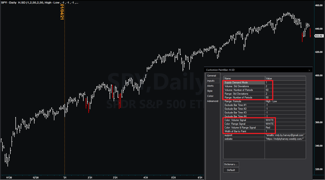
Volume and Range extremes. The following chart shows SPY with the indicator installed and its configuration. During 2021, purchasing SPY on the day following a 50 period, 2+ standard deviation of the daily range and volume (displayed as red bars) has been a successful tool to time a "buy the drop" entry into the market.
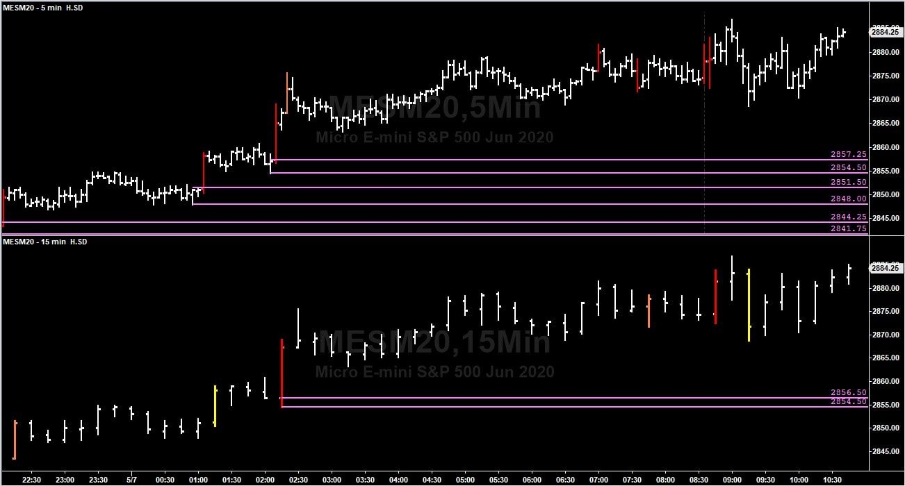
Multiple timeframe analysis. The following chart shows the micro ES futures symbol inserted into a chart analysis window twice. Sub-graph 1 is set to 5 minutes. Sub-graph 2 is set to 15 minutes. The indicator is applied to both charts in its default configuration. The pink horizontal lines are drawn with the default Fibonacci Price Retracement Lines drawing tool (only 0% & 100% are displayed) and represent a potential supply/demand "zone".
I placed the "fib lines" where they looked to make most sense and will focus on the price points where there appears to be a "zone" in both the 5 minute and 15 minute timeframes.
I placed the "fib lines" where they looked to make most sense and will focus on the price points where there appears to be a "zone" in both the 5 minute and 15 minute timeframes.